Skip links

9 Simple Ways To Make Your Website Easier To Navigate For Your Users

Understanding user navigation is vital for the success of any website. It involves ensuring that visitors can effortlessly explore the site and find what they need. To achieve this, it’s essential to empathize with users and understand their preferences and browsing behavior. Designing navigation with their needs in mind leads to an intuitive and enjoyable experience.

Simplifying navigation paths and organizing menus logically are fundamental steps in improving user navigation. A well-structured menu, positioned prominently, guides visitors to different sections of the website with ease. Additionally, implementing a mobile-friendly design is crucial, as more users access the internet from their smartphones and tablets. An efficient search functionality further enhances navigation, enabling users to find specific information or products quickly. Visual cues, such as clear calls-to-action, help users know where to click and what actions to take. By prioritizing user-centric navigation, web designers create a seamless experience that keeps visitors engaged and encourages them to explore more, ultimately leading to higher satisfaction and conversions.

The Importance of User-Centric Web Design

User-centric web design is of utmost importance in creating websites that resonate with their target audience and deliver an exceptional user experience. Instead of focusing solely on aesthetics and technical aspects, user-centric design prioritizes the needs, preferences, and behaviors of the users.

By understanding the target users and their goals, web designers can tailor the website’s layout, content, and functionalities to cater to their specific requirements. This approach ensures that the website addresses the pain points of users, provides relevant information, and offers intuitive navigation. When users find a website that caters to their needs, they are more likely to stay engaged, explore further, and ultimately convert into customers or take desired actions.

User-Centric Web Design

User-centric design also emphasizes usability and accessibility. A website that is easy to navigate, quick to load, and works well across various devices ensures a seamless experience for users. Additionally, focusing on accessibility ensures that people with disabilities can also access and interact with the website, promoting inclusivity and a broader reach.

Moreover, user-centric web design fosters positive interactions and emotional connections with the brand. When users feel understood and valued, they are more likely to develop trust and loyalty towards the brand. This can lead to repeat visits, recommendations to others, and increased customer retention.

Furthermore, a user-centric approach promotes continuous improvement through feedback and data analysis. By collecting user feedback and analyzing user behavior, designers can identify areas for improvement and implement iterative changes to enhance the user experience continuously.

Streamlining Your Website Navigation: A Step-by-Step Guide

In the fast-paced digital landscape, a streamlined and user-friendly website navigation is paramount to keep visitors engaged and satisfied. A well-organized navigation system not only helps users find the information they seek effortlessly but also improves overall user experience and boosts conversion rates. In this step-by-step guide, we will explore essential strategies to optimize your website’s navigation. By understanding your audience, planning a clear site structure, implementing mobile responsiveness, and leveraging search functionality, you can create an intuitive navigation experience that keeps visitors exploring and interacting with your website. Let’s dive in and unlock the secrets to a more user-centric and successful website navigation.

1. Clear and Intuitive Menus: The Backbone of User-Friendly Websites

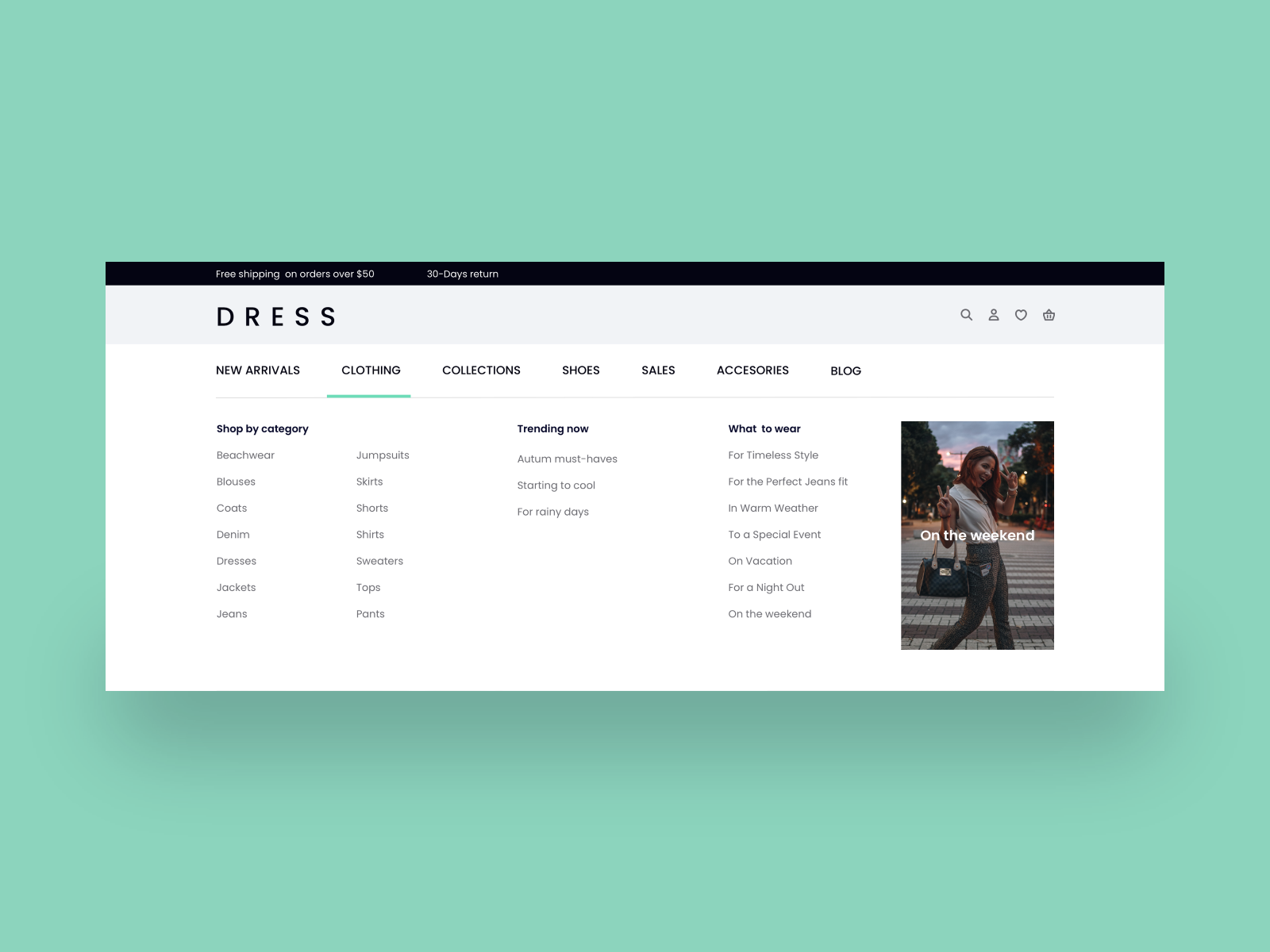
Clear and intuitive menus serve as the backbone of user-friendly websites, providing visitors with a roadmap to effortlessly explore and access the desired content. As one of the most critical elements of website navigation, a well-designed menu enhances the overall user experience and contributes to higher engagement and conversions.

Intuitive Menus

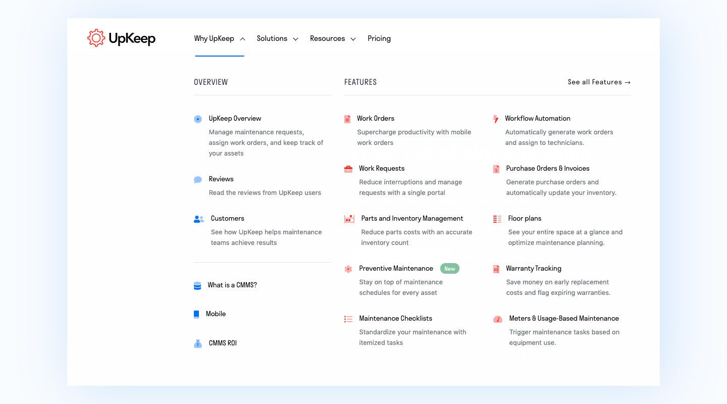
By organizing information in a logical manner and using descriptive labels, users can quickly understand the website’s structure and find what they’re looking for without frustration. In this blog, we will delve into the art of crafting user-friendly menus, exploring best practices, and understanding how they shape the success of a website. Get ready to unlock the secrets to creating menus that leave a lasting positive impression on your visitors.

2. Enhancing User Experience with Intuitive Navigation Paths

Enhancing user experience with intuitive navigation paths is a key strategy for creating a website that keeps visitors engaged and satisfied. Intuitive navigation paths guide users through the website seamlessly, allowing them to find the information they need with minimal effort. By understanding user behavior and preferences, web designers can design navigation that aligns with how users naturally interact with the site. In this blog, we will explore the importance of intuitive navigation, the principles behind it, and practical tips to implement it effectively. Discover how intuitive navigation paths can elevate your website’s user experience and lead to increased user satisfaction and success.

3. Responsive Design: Making Your Website Accessible on All Devices

Responsive design is a critical aspect of modern web development, ensuring that your website is accessible and functional across all devices, including desktops, tablets, and smartphones. With an increasing number of users accessing the internet from various devices, a responsive website is no longer a luxury but a necessity.

Responsive Design

In this blog, we will delve into the importance of responsive design, how it works, and the benefits it offers to both users and website owners. Learn how responsive design can optimize the user experience, improve search engine rankings, and ultimately lead to higher engagement and conversions. Get ready to take your website to the next level with a design that adapts flawlessly to every screen size and device.

4. Utilizing Search Functionality for Effortless Exploration

Utilizing search functionality is a powerful tool for creating an effortless exploration experience on your website. While well-organized navigation menus are essential, some users prefer to search directly for specific information or products. Implementing an effective search bar with intelligent algorithms and autocomplete suggestions can dramatically improve user experience, helping visitors find what they need quickly and easily. In this blog, we will explore the importance of search functionality, the elements of a robust search system, and practical tips to optimize its performance. Discover how leveraging search functionality can enhance user satisfaction, boost engagement, and lead to higher conversions on your website. Get ready to unlock the potential of search and take your website’s navigation to new heights.

5. Keeping It Simple: Minimizing Clutter for Smooth Navigation

Keeping it simple is a fundamental principle in creating a user-friendly website navigation. Clutter-free navigation ensures that users can move through your website with ease, finding the information they need without feeling overwhelmed. In this blog, we will explore the importance of simplicity in web design, how clutter impacts user experience, and practical tips for streamlining your navigation. By eliminating unnecessary elements, organizing content strategically, and employing whitespace effectively, you can create a seamless navigation experience that delights users and encourages them to explore further. Join us as we dive into the art of minimalism in web design and discover how it can lead to a more successful and user-centric website.

6. The Power of Call-to-Action Buttons in Guiding Users

Call-to-action (CTA) buttons hold immense power in guiding users through your website and encouraging them to take specific actions. These small yet impactful elements serve as signposts, directing visitors towards the desired goals, such as making a purchase, subscribing to a newsletter, or signing up for a service. In this blog, we will explore the significance of well-designed CTA buttons, the psychology behind their effectiveness, and best practices for creating compelling CTAs that drive conversions.

Call-to-Action Buttons

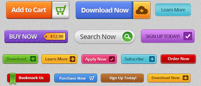
From choosing the right placement and color to crafting persuasive copy, we’ll uncover the secrets to maximizing the power of CTA buttons in guiding users and boosting engagement on your website. Prepare to unleash the potential of CTAs and create a user experience that motivates visitors to take action and achieve your business objectives.

7. Testing and Iterating: Improving Navigation Based on User Feedback

Testing and iterating based on user feedback is a crucial process in continuously improving website navigation and enhancing the overall user experience. By collecting valuable insights from user interactions, behavior, and feedback, web designers can identify pain points and areas for improvement in the navigation system. In this blog, we will explore the benefits of user testing, different testing methodologies, and how to effectively gather and analyze user feedback. Embracing an iterative approach empowers web designers to make data-driven decisions, implement changes, and fine-tune the navigation to better align with user needs and preferences. Join us as we unravel the secrets to creating a user-friendly website through ongoing testing and refinement, ensuring that your website’s navigation remains intuitive and engaging for your audience.

8.Navigating Beyond the Home Page: Creating Seamless Transitions

Navigating beyond the home page is a critical aspect of website design, as it involves creating seamless transitions between different pages and sections. While the home page serves as the entry point, the overall user experience relies on how well users can move between content without feeling disoriented. In this blog, we will delve into the importance of smooth transitions, the role of navigation aids like breadcrumbs and internal linking, and practical tips for guiding users through your website effortlessly. Learn how to create a cohesive user journey, keeping visitors engaged and exploring deeper into your website’s valuable content. Join us as we uncover the secrets to crafting a seamless navigation experience that leaves a lasting positive impression on your audience.

9. Accessibility Matters: Ensuring Inclusivity in Website Navigation

Accessibility matters greatly in website navigation to ensure inclusivity and provide equal access to all users, regardless of their abilities or disabilities. An accessible website allows individuals with visual impairments, motor disabilities, cognitive challenges, and other conditions to navigate and interact with the content effectively. In this blog, we will explore the significance of web accessibility, the impact of accessible navigation on users, and best practices for creating an inclusive navigation experience.

Inclusivity in Website Navigation

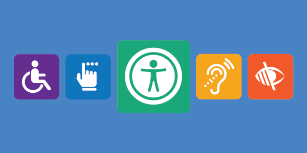
From using proper heading structures and descriptive alt text to implementing keyboard navigation and adhering to accessibility guidelines, we will uncover the steps to make your website welcoming and usable for everyone. Join us as we embrace the principle that a truly successful website is one that considers the diverse needs of its users and strives to ensure that no one is left behind.

Bonus: Expert Tips to Optimize Website Navigation for Conversions

Optimizing website navigation for conversions is a key strategy to turn visitors into loyal customers and achieve your business goals. In this bonus section, we will share expert tips to take your website navigation to the next level:

  1. Prioritize Clarity: Ensure that your navigation labels are clear, concise, and easy to understand. Use language that resonates with your target audience and aligns with their expectations.
  2. Test Placement and Layout: Experiment with different navigation placements, such as top menus, sidebars, or hamburger menus for mobile. Analyze user behavior through A/B testing to determine which layout drives the highest engagement and conversions.
  3. Emphasize Primary Actions: Make your most important CTAs prominent in the navigation, guiding users to take desired actions. Whether it’s “Buy Now,” “Sign Up,” or “Contact Us,” strategic placement increases the chances of conversion.
  4. Use Visual Cues: Employ visual cues, such as arrows or animated elements, to direct users’ attention to important navigation elements or CTAs.
  5. Limit Navigation Options: Avoid overwhelming users with too many navigation choices. Focus on essential sections and products to streamline the decision-making process.
  6. Implement Sticky Navigation: Keep the navigation menu fixed at the top of the screen as users scroll, ensuring easy access to important sections throughout the browsing experience.
  7. Leverage Microinteractions: Use subtle animations or hover effects on navigation elements to enhance user engagement and create a more interactive experience.
  8. Optimize Load Times: Ensure that your navigation and website load quickly on all devices. Slow loading times can lead to user frustration and higher bounce rates.
  9. Provide Feedback: Offer visual feedback, such as changing the appearance of clicked links or buttons, to reassure users that their actions are being processed.
  10. Personalize Navigation: Use user data to personalize the navigation experience, presenting relevant content or products based on their preferences and past behavior.
  11. Include Clear Contact Information: Make it easy for users to find your contact details in the navigation, allowing them to reach out for inquiries or support.
  12. Monitor Analytics: Continuously analyze website analytics to identify navigation bottlenecks and user drop-off points. Use this data to make informed improvements.

By implementing these expert tips, you can optimize your website navigation for conversions, enhancing the user experience and driving higher engagement and sales. Remember, a user-friendly and conversion-focused navigation is the key to turning your website visitors into satisfied customers and achieving long-term success.

Conclusion On 9 Simple Ways To Make Your Website Easier To Navigate For Your Users

In conclusion, website navigation is a critical factor that directly impacts the success of your online presence. Understanding user behavior, preferences, and needs is key to crafting a navigation system that resonates with your target audience. By empathizing with users and creating clear, intuitive menus, you can guide visitors seamlessly through your website, making it easy for them to find the information they seek and take desired actions.

Responsive design ensures that your website remains accessible and functional across various devices, catering to the growing number of mobile users. The power of search functionality allows users to find specific information quickly, while streamlined navigation with minimal clutter creates a smooth and enjoyable browsing experience.

Incorporating effective call-to-action buttons strategically directs users towards your business goals, improving engagement and conversions. Furthermore, continuous testing and iterating based on user feedback help you refine your website’s navigation and meet evolving user needs.

Finally, accessibility in website navigation ensures inclusivity, making your site welcoming to all users, regardless of their abilities. Prioritizing accessibility not only promotes equal access but also demonstrates your commitment to user-centric design.

By applying the insights and best practices shared in this guide, you can create a user-friendly, engaging, and conversion-focused website navigation that sets your online presence apart. Remember, the journey does not end at the home page; it extends to every aspect of your website, guiding users towards success and leaving a lasting positive impression. Embrace the art of thoughtful navigation, and your website will become a delightful destination for users, fostering loyalty, and driving sustainable growth for your business.

Home
Account
Cart
Search
Explore
Drag