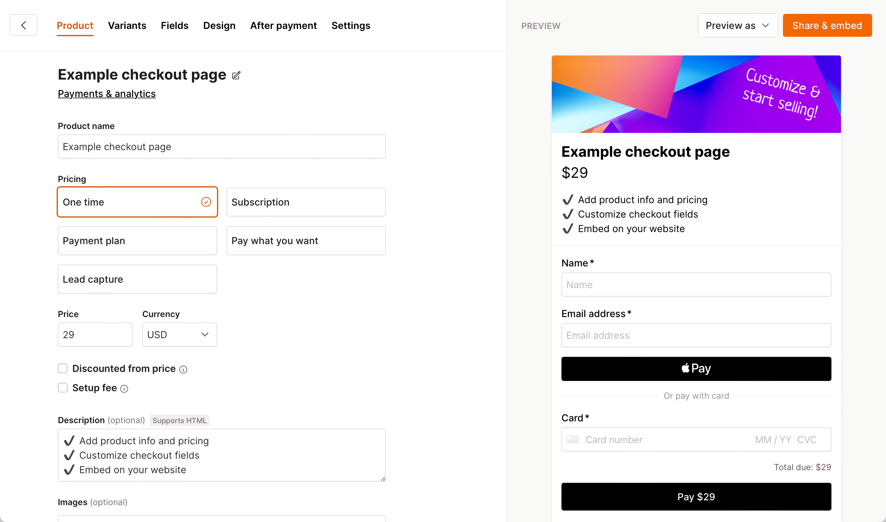

In the intricate tapestry of the online shopping experience, the checkout page emerges as the final destination—a crucial juncture where users either complete their journey with satisfaction or abandon their carts in frustration. The key to steering users toward the former lies in the artful construction of a clean and intuitive design.
- The Symphony of Simplicity: Picture your checkout page as a serene landscape, uncluttered by unnecessary elements. A clean design not only enhances visual appeal but also serves a functional purpose. Remove any superfluous information or graphics that might divert attention, allowing users to focus solely on the task at hand.
- Intuitive Navigation as a Compass: Navigation should feel like second nature. Streamline the user’s path from one step to the next, eliminating any potential stumbling blocks. Whether it’s reducing the number of clicks required or providing a logical flow, an intuitive navigation system ensures users don’t feel lost in the maze of the checkout process.
- Labels: The Language of Clarity: Every button, field, and section in your checkout page has a role to play in the user’s journey. Equip them with clear and concise labels. Think of labels as signposts on a well-marked trail, guiding users effortlessly through the various stages of the checkout process. Ambiguity is the enemy; clarity is your ally.
- Distraction-Free Environment: Imagine a quiet, focused room where a task can be completed without interruptions. Your checkout page should offer a similar environment. Minimize distractions by removing unnecessary pop-ups, banners, or unrelated product suggestions. Keep the spotlight firmly on the transaction, allowing users to progress without unnecessary detours.
- Mobile Responsiveness: In an era where users seamlessly switch between devices, your checkout page must be a responsive chameleon, adapting effortlessly to different screen sizes. A mobile-friendly design ensures that whether users are on a desktop, tablet, or smartphone, the checkout process remains smooth and accessible.
In essence, a well-crafted checkout page is not just a functional component of your e-commerce platform; it’s a carefully curated experience. By embracing the principles of clean design, intuitive navigation, clear labels, and a focus on minimizing distractions, you lay the foundation for a seamless journey that culminates in a completed purchase. Join us as we explore these elements in greater detail, unlocking the secrets to a checkout page that guides users with precision and finesse.
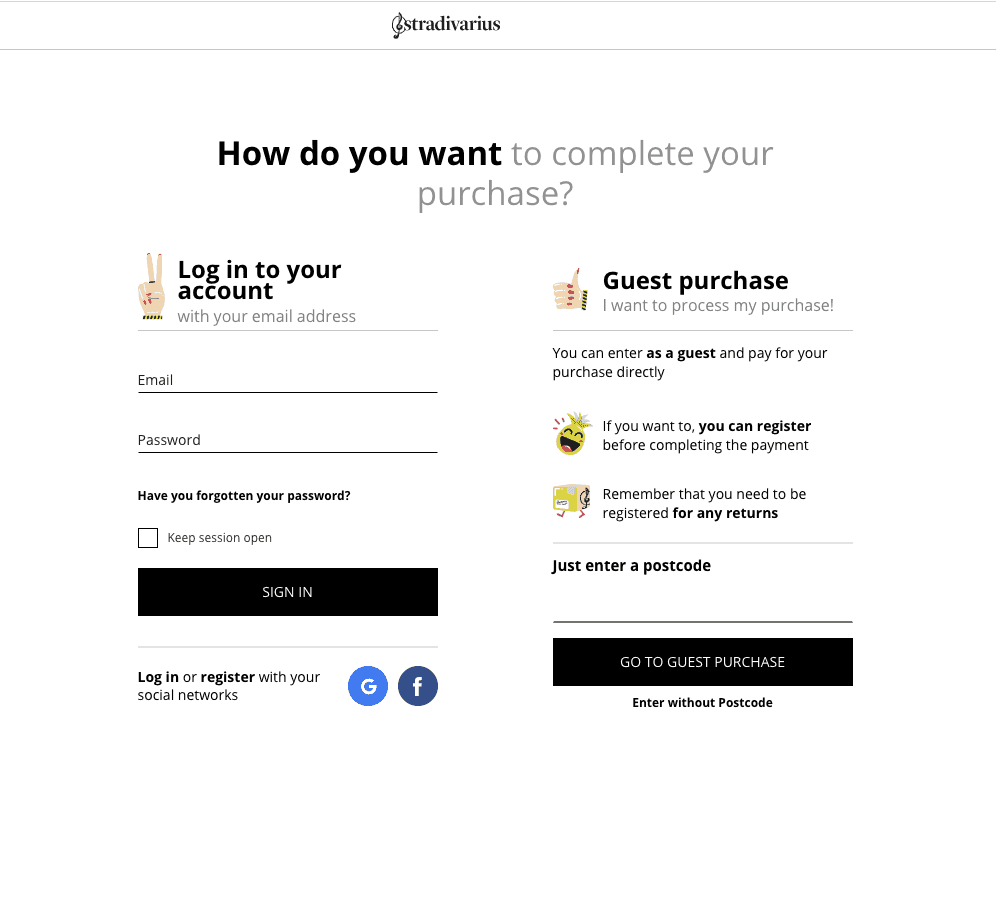
When it comes to buying stuff online, nobody likes extra steps or hoops to jump through, especially if you’re a first-timer. So, here’s the deal: offer a guest checkout option. No need to sign up for an account – just pick what you want, pay, and you’re done.
- No Strings Attached: Ever walked into a store and bought something without having to join a club? Guest checkout is like that. No mandatory account creation. You just breeze through, pick what you want, and get on with your day.
- Quick and Easy: Time is money, and nobody wants to spend more time than necessary buying stuff online. Guest checkout trims the fat. No need to fill out forms or remember passwords – just a straightforward process to complete your purchase pronto.
- Keep It Simple for Newbies: First-time customers might be a bit cautious. So, let’s not overwhelm them. Offering a guest checkout option shows that you get it – you’re not here to complicate things. Just grab what you want, pay, and you’re part of the club without any hassle.
- Trust the Choice: Some folks are just not into commitment on the first date. Guest checkout respects that. It’s like saying, “Hey, you can sign up if you want, but if not, that’s cool too.” It’s all about giving customers the freedom to choose how they want to roll.
- Get In, Get Out: Think of guest checkout as the express lane. It’s designed for those who want a quick, straightforward buying experience. No need to stick around longer than necessary – just make your purchase and move on with your day.
So, there you have it. Guest checkout is not just a button; it’s a friendly nod to simplicity. It’s the online shopping equivalent of a high-five, saying, “Welcome, grab what you need, and see you again soon!”

When you’re buying stuff on your phone, it’s got to be easy, right? Nobody wants to zoom in and out or play a game of ‘Where’s the Button?’ That’s why, when it comes to your checkout page, think mobile-friendly all the way.
- Small Screens, Big Buttons: Phones have small screens, so let’s not make users squint. Make all the buttons big and easy to tap. If you need a microscope to hit ‘Buy Now,’ it’s a problem. Keep it simple, keep it big.
- Everything in Reach: Ever had to play finger gymnastics to tap on a button at the bottom of your screen? Not fun. Arrange everything so users can reach it comfortably. No need for finger acrobatics – make sure all the important stuff is within easy thumb reach.
- No Zooming Required: Imagine having to zoom in to read tiny text or hit a button. Annoying, right? Ensure your checkout page is like a well-fitted suit for mobile screens – no need to pinch, zoom, or twist your phone to complete a purchase.
- Short and Sweet Forms: Typing on a small keyboard is not a favorite pastime. Keep the forms short and sweet. Nobody wants to fill out a novel on their phone. The quicker and easier, the better.
- Test on Different Phones: Not all phones are created equal. Test your checkout on different devices – Android, iPhone, maybe even that old flip phone your uncle still uses. Make sure it’s smooth sailing for everyone.
So, there you have it. Mobile-friendly checkout is like having a friend who makes everything easier. Big buttons, easy reach, no zooming – just a smooth process from adding to cart to hitting ‘Place Order.’ Because when it comes to mobile, simplicity is key.
![]()
Shopping online should be like shopping in a store – you see the price, and that’s what you pay. No surprises. That’s why, when it comes to your checkout page, clear is the name of the game. Lay it all out – product prices, shipping costs, any extra fees. Let your customers know what they’re getting into from the get-go.
- No Hidden Costs: Ever thought you found a great deal, only to see a bunch of extra charges at checkout? Not cool. Be upfront. Show the product price, shipping costs, and any additional fees right there on the page. No surprises means happy customers.
- What You See is What You Pay: Keep it simple. If something costs $10, say it costs $10. Don’t make customers dig around to find out the real price. Transparency is like a good friend – always honest and upfront.
- Shipping – Don’t Keep it a Secret: Shipping costs can be a deal-breaker. If there’s a charge, make it crystal clear. Nobody likes reaching the checkout and finding out the shipping is as much as the product. Be honest about it, and your customers will appreciate it.
- Break Down the Math: Breakdowns are good, especially when it comes to costs. Show customers the nitty-gritty – product price, shipping, taxes, any other fees. Break it down so there’s no confusion about where their money is going.
- Trust Comes from Transparency: Trust is hard to earn, but transparency is the key. When customers see you’re being upfront about costs, they know you’re not trying to pull a fast one. That builds trust, and trust means repeat business.
So, in the world of online shopping, be the one who lays it all out on the table. Clear prices, shipping costs, and fees. No secrets, no surprises – just a straightforward shopping experience where customers know exactly what they’re paying for.
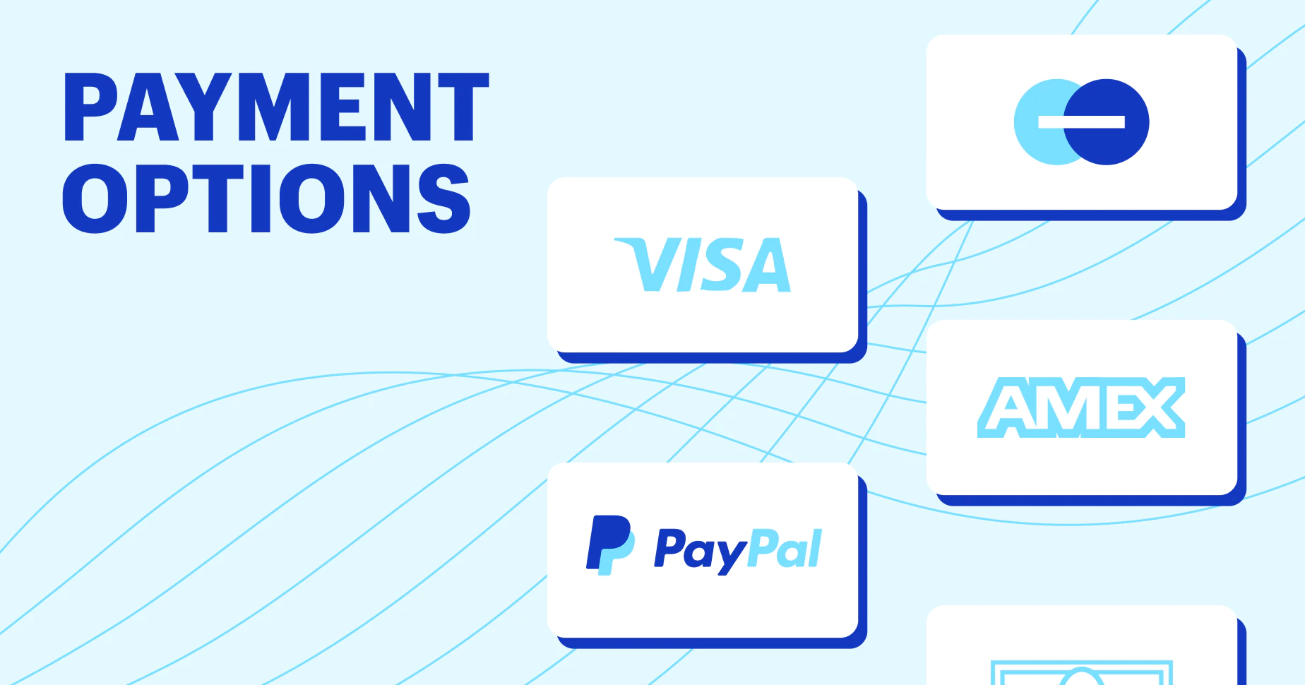
Everybody’s got their favorite way to pay – some like credit cards, others prefer digital wallets. Your job? Make it easy for everyone. When it comes to your checkout page, offer a bunch of ways to pay. Credit cards, digital wallets, whatever’s popular – the more options, the better.
- Plastic Fantastic – Credit Cards: Most folks have a credit card in their wallet. Make sure your checkout page is ready for them. Whether it’s Visa, Mastercard, or Amex – accept them all. Don’t make customers think twice about how they want to pay.
- Go Digital – Wallets Welcome: Digital wallets are the new cool kids on the block. If people want to pay with Apple Pay, Google Pay, or any other digital wallet, let them. It’s like handing over cash without the actual cash – super convenient.
- Keep It Simple: Don’t complicate things. If you make paying a puzzle, customers might just give up. Offer simple, easy options that everyone understands. The goal is to make checkout a breeze, not a brain teaser.
- What’s Trending – Stay Updated: Payment trends change. Stay on top of what’s popular. If a new payment method is making waves, consider adding it to your lineup. Being up-to-date means your customers won’t feel left out of the payment party.
- Convenience is King: The key here is convenience. When customers see you’re flexible with how they pay, it’s a win. It’s like saying, “Hey, we’re here to make your life easier.” And that’s what it’s all about – an easy, hassle-free checkout process.
So, when it comes to payments, be the easygoing friend who’s cool with whatever. Credit cards, digital wallets – the more, the merrier. Keep it simple, stay updated, and make paying a piece of cake. Because when customers can pay their way, checkout becomes a whole lot smoother.
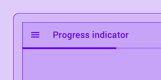
Ever stood in a line with no idea how far you were from the front? Frustrating, right? Well, your checkout page is like a virtual line, and customers want to know where they stand. That’s where a progress bar or step indicators come in handy. It’s not just a visual thing – it’s a way to say, “Hey, we’re getting there, stick with us.”
- Show and Tell: Imagine if you had a roadmap when you started something new. A progress bar is like that roadmap for your checkout process. It shows customers where they are and where they’re headed. No surprises, just a clear path.
- Breaking It Down: Checkout can feel like a series of hurdles. Break it down into steps, and suddenly it’s not a marathon – it’s a few manageable sprints. Each step on the progress bar is a checkpoint, making the whole process less overwhelming.
- Less Guesswork, More Confidence: Nobody likes guessing games, especially when it comes to spending money. A progress bar tells customers, “Here’s where you are, here’s where you’re going.” It builds confidence and reduces that nagging feeling of, “Is this going to take forever?”
- Time Management 101: Time is precious. A progress bar helps manage expectations. Customers can glance at it and think, “Okay, almost there.” It’s a subtle way of saying, “We value your time, and we’re making this as quick and painless as possible.”
- Smooth Sailing: A progress bar is like a gentle nudge, saying, “You’re doing great, keep going.” It transforms the checkout process from a potential headache to a smooth, guided journey. Customers appreciate knowing how far they’ve come and how much is left.
In a nutshell, a progress bar is not just a design element; it’s a practical tool. It breaks down the checkout process, keeps customers in the loop, and turns what could be a daunting experience into a manageable journey. So, guide your customers through with a progress bar – because everyone likes to know they’re making progress.

When you’re buying online, trust is everything. Nobody wants to worry about their info floating around the internet. That’s why, on your checkout page, make it clear that their personal stuff is safe. Show off trust badges, SSL certificates – all that security stuff. It’s not just for show; it’s peace of mind.
- Trust Badges Speak Louder Than Words: Trust badges are like a virtual handshake. They say, “We’ve got your back.” Display them prominently on the checkout page. It’s a small thing, but it screams, “You can trust us.”
- SSL – The Online Bodyguard: SSL certificates are the bouncers at the digital door. They ensure the info passed between your customer and you is locked down tight. Tell your customers about it – it’s like assuring them there’s a big, reliable lock on the door.
- Ease Those Jitters: Customers get jittery when it comes to entering personal info. Make it a breeze for them by showing that you take security seriously. Trust badges and SSL certificates act as a virtual security guard, easing those nerves.
- The Visible Shield: Imagine if your house had an invisible force field protecting it. It’s reassuring, right? Trust badges and SSL certificates are your digital force field. Make sure your customers see it – it’s like turning on the porch light to let them know you’re watching out for them.
- Confidence Boost: Online shopping is like a leap of faith. Displaying security assurances is like saying, “We’ve got a safety net.” When customers see those badges and certificates, it’s a confidence boost. It’s the nudge that says, “Go ahead, we’ve taken care of the security stuff.”
In the end, it’s not just about having security measures in place – it’s about letting your customers know you’ve got it covered. Trust badges and SSL certificates are your way of saying, “Your info is safe with us.” So, make it clear on the checkout page. Because when customers feel secure, they’re more likely to hit that ‘Complete Purchase’ button with confidence.
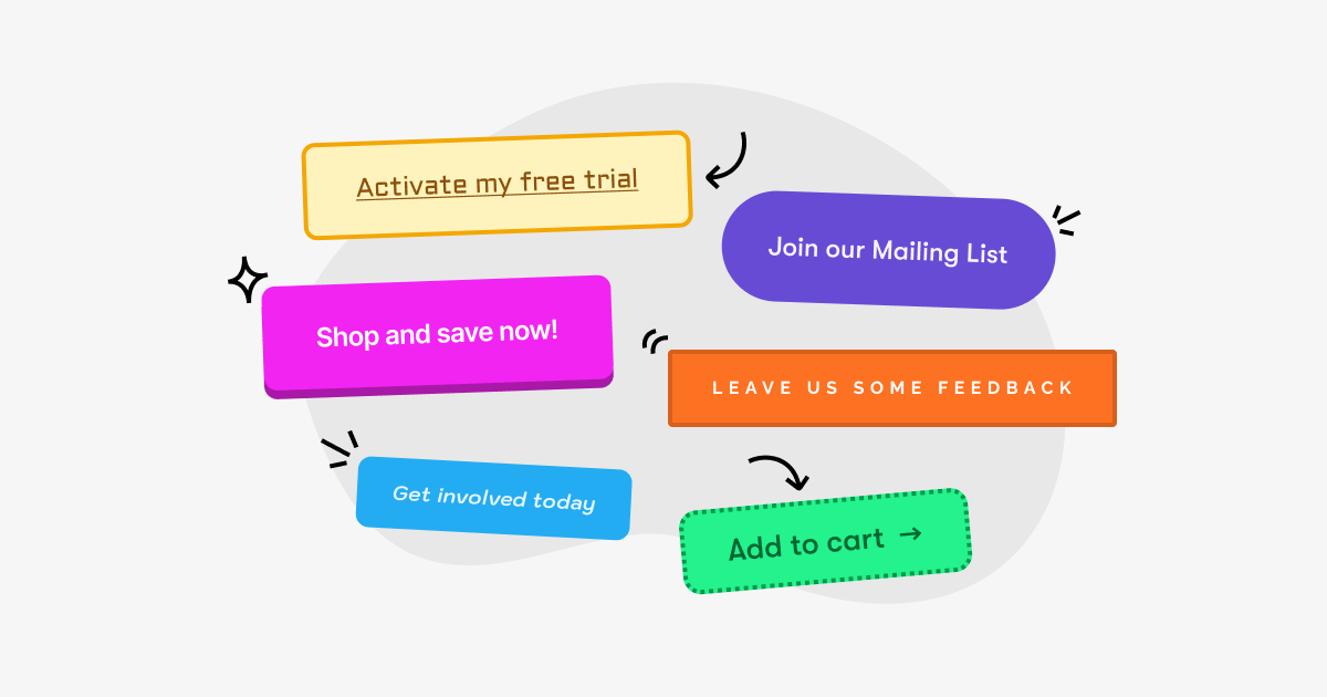
Alright, you’ve gone through the whole process, and now it’s time for the grand finale – the button that seals the deal. Make it simple, make it clear. Your call-to-action button, whether it’s saying “Complete Purchase” or “Place Order,” needs to stand out. Think of it like a sign saying, “This way to a happy purchase.”
- Simple Words, Big Impact: Your call-to-action button is not the place for fancy words. Keep it simple. “Complete Purchase” or “Place Order” – customers need to know exactly what they’re doing. No room for confusion.
- Make it Pop: Imagine a sea of text, and there, in the middle, is your button, popping with a different color. That’s what you want. Make it stand out visually. It’s like a beacon, guiding users to the finish line.
- Confidence in Clarity: Your button is not the time to be mysterious. If you want users to complete their purchase, tell them directly. “Complete Purchase” is crystal clear. Users shouldn’t have to guess what happens when they click that button.
- Put it Where They Can’t Miss: Ever walked into a store and couldn’t find the checkout? Not fun. Your call-to-action button is your virtual checkout counter. Put it where users can’t miss it – usually at the bottom of the page, ready for action.
- Size Matters: Size doesn’t always matter, but in this case, it does. Your button needs to be big enough to be noticed without taking over the whole page. Find that sweet spot where it’s prominent but not overwhelming.
Remember, your call-to-action button is the last step in the dance. Keep it simple, make it pop, and put it where users can’t miss it. It’s like saying, “You’ve made your choices, now let’s seal the deal.” Because when that button stands out, users can take that final step with confidence.
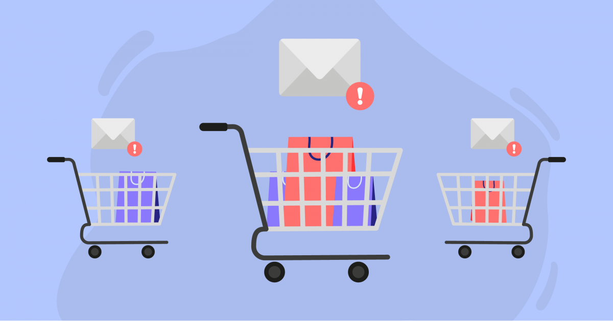
Ever wonder what happened to that stuff you left in your online cart? It’s a common thing – folks add items but don’t hit that final purchase button. Here’s the deal: don’t let those abandoned carts slip away. Use simple strategies like follow-up emails or pop-ups when someone is about to leave. Remind them of what’s in their cart and sweeten the deal with personalized offers or discounts. It’s not rocket science; it’s just smart business.
- The Friendly Reminder Email: Sending an email is like a friendly tap on the shoulder. “Hey, you left something behind!” Keep it simple, remind them of what’s in their cart, and include a link to easily pick up where they left off. A little nudge can go a long way.
- Exit-Intent Pop-Ups: Ever seen a pop-up just as you’re about to leave a site? That’s an exit-intent pop-up. It’s not annoying; it’s a second chance. Use it to remind users of their cart items and throw in a little incentive like a discount or free shipping. It’s like saying, “Wait, before you go, how about a deal?”
- Personalized Offers for the Win: Personalization is the secret sauce. Tailor your follow-ups with personalized offers or discounts based on the items in their cart. It’s not just a generic “Come back.” It’s more like, “We noticed you liked this – here’s a little something to sweeten the deal.”
- Keep It Simple, Not Spammy: Nobody likes a bombardment of emails. Keep it simple, not spammy. A gentle reminder and a good offer – that’s all you need. It’s like a respectful, “Hey, we’d love to have you back.”
- Test and Tweak: Every audience is different. Test your strategies and see what works. Maybe some customers respond better to emails, while others prefer pop-ups. Tweak your approach based on what brings those abandoned carts back into the fold.
In the end, recovering abandoned carts is about being friendly, not pushy. A well-timed email or pop-up with a personalized touch can turn a “Maybe later” into a “Let’s do this.” It’s not just a strategy; it’s common sense in the world of online shopping.